
Shelves
The default view. The user’s books grouped into “shelves” sorted by relevance—like High Priority, My Recommendations, Come Back Later, Fiction, Classics, etc.


I decided to explore the issue and design what a better book tracking app might look like. Though I had some of my own ideas about what I’d personally like to see in a product, I tried to put my personal instincts aside and explored the problem space by talking with other users.
I began my research with competitor analysis. As a begrudging user of Goodreads (an Amazon-owned website and app with a monopoly in the market niche), I was well-familiar with its features and shortcomings, but I used this opportunity to step back and try to assess the product objectively and to explore other competitor products.
I also studied a successful product in a parallel market—the film tracking app Letterboxd—since many of its features could be applied.
However, the core of my research was a series of one-on-one user interviews with frequent or aspiring readers, focusing on better understanding their reading habits, attitudes, and experiences with any competitor products.
Below are five selected research findings and the design insights they inspired.
More than other forms of media, people see the books they read and own as an extension of their selves—physical representations of their tastes and interests—and therefore may put great care into how they curate and display them.

All subjects said that the physical aspect of reading is critical to its appeal and said they used reading as something constructive to do before bed to avoid looking at a screen.

All participants were unanimous in the factors they considered as they chose a book to start next—broad category (ex: fiction or nonfiction, classic or contemporary) followed by perceived difficulty (based largely on page length).
These points came up with each person I interviewed. Most discussions of books online center around contemporary mainstream books from large publishers, leaving readers who want something else unsure where to look.
More than for other forms of media, people tend to rely on peer recommendations for books— trusted sources carry more weight than mass consensus (like overall rating or popularity). Two subjects singled out the “staff picks” selections at their local boutique bookstores as places where they’ve discovered books.

Often, the user may have an idea of the type of book they’d like to read but feel stuck about finding specific recommendations.
To make their “want to read” list less overwhelming, people commonly have a rotating group of “high priority” books reflecting what is most appealing to them at that time. This group may simply be a pile of books on their bedside table.

I built a simple interactive prototype to be used for user testing, focusing on a few core flows: using the wizard book suggestion tool, exploring the app’s featured lists, navigating through the My Books tab, and customizing the favorites shelf on the user profile.
Users were highly positive about the staff picks/featured lists section, the built-in high priority list, the “Get suggestions” wizard flow, and the customizable favorites shelf on the user profile.
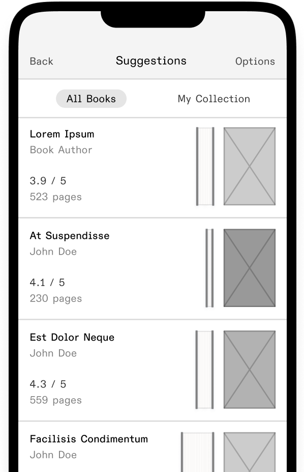
Some users were delighted and highly enthusiastic about the feature, while others were entirely disinterested. It seemed that visually-oriented users appreciated the feature, while others felt that it was redundant since the page length was also displayed as a number. However, all subjects liked the use of the spines next to large cover images (ex: on featured lists and book detail pages).
For list cards, I decided to move the spine feature to an optional toggle in the view options panel. To increase discoverability, a tooltip could highlight the feature.
Note: I suspect that the lo-fi nature of the prototype was contributing to some subjects’ confusion about the spines. If I had more time, I would test this feature again with a high-fidelity mockup to see if the issue persisted.

More than other forms of media, people see the books they read and own as an extension of their selves—physical representations of their tastes and interests—and therefore may put great care into how they curate and display them.

The default view. The user’s books grouped into “shelves” sorted by relevance—like High Priority, My Recommendations, Come Back Later, Fiction, Classics, etc.
One long (sortable and filterable) list of all books in the user’s collection.
Same as “All,” but only books marked as previously read.
Same as “All,” but only unread books (those marked “Want to read” as well as “Currently reading” and “Come back later”).
In the initial design, the My Books tab contained four module tabs. In most use cases, the Shelves view would provide the most utility, but there were also situations in which a comprehensive list of all books (which the user could then sort and filter) would be most helpful.
The very first user testing sessions confirmed my suspicion that these tabs needed rethinking.
All / Read / Unread had a clear relationship, but users were confused by how Shelves related to the other three tabs.
I adjusted the prototype to remove the Shelves tab but keep its functionality—books are shown grouped into shelves in the three remaining tabs. If needed, the option to see all books as a long list was preserved, but instead of being the highest level view for each tab, the list was relocated to the first shelf shown on each page.
In following user testing sessions, users reported that the tab organization was intuitive and correctly answered questions about navigational tasks within the My Books section.

These changes included improving copy to more closely match the users’ mental models, adjusting the position of high-traffic elements to make them more accessible on mobile devices, and adding the “Get suggestions” wizard tool to the home page.
My first instinct was to use a “literary” serif typeface for the top-level headings and a sans-serif for the subheadings and body text, but after playing around with different combinations, I felt that the visual contrast between the text styles competed with the typography and imagery of the book covers as the sole aesthetic focus.
Instead, I selected Theinhardt Pan, an all-purpose grotesque typeface, for all text styles. While clean and neutral, the font’s slightly undersized x-height and subtly squared-off curves give it personality and warmth.
However, the typeface’s numerical characters had a little too much personality—and since numbers conveyed critical information within the app, I chose a secondary font to be used when numerical characters are the focus. I went with a system font, SF Compact Display, to maximize legibility on small screen sizes.

To make it more playful and visually interesting, I made the two halves slightly asymmetrical—both in arc shape and line weight—to create the illusion of being further along in the book.
I mirrored this changing line weight in the wordmark to create continuity.

Since the goal of the product was to complement the physical act of book collecting and reading rather than to replace it, I didn’t want the books to be represented purely as flattened digital images.
To emphasize the connection between the digital “books” in the user’s collection and their real-life physical counterparts—the true heart of the product—I created a mockup component which added tactile details to the covers.

The grain overlay slightly toned down the itensity of the images, softening the contrast between covers. This lent the books a subtly worn-in quality and made them appear to be a more cohesive collection.

Since my research found that users frequently read before bed, it was important to design a dark mode which minimizes blue light while maintaining adequate contrast.
Note: If the videos aren't playing in your browser, you can also view them on Dropbox.
Note: If the videos aren't playing in your browser, you can also view them here.