
It quickly and clearly conveys critical information.
How much information does the subject absorb after short exposure to one of the screens?


For over two decades, Bolton Energy Solutions has designed and produced solar power systems ranging anywhere from personal standalone units to solutions for large-scale commercial properties like hotels, apartment complexes, and corporate offices for household-name Fortune 500 companies.
Bolton customers need a way to monitor their systems that is immediate and accurate, providing them with exact metrics in real time. Enter the console, a tool to remotely monitor power systems and identify irregularities early on so they can be addressed and resolved before they become critical. When I was brought in, the product was in early development, but the interface urgently needed a redesign.
Before beginning my research, I defined some objectives to continually refer to throughout the design process.
I didn’t have access to current customers (hypothetical future console users) as interview subjects. Instead, I had to rely on lengthy conversations with stakeholders and subject matter experts to draw out the information I needed in order to put myself in the user’s shoes.
I approached the project with two guiding questions:
Company bigwigs (owners of power systems), hobbyists, DIYers
System monitors (employees hired to monitor groups of power systems), field technicians
Since the first group would use the console much more regularly than the second and have more risk and responsibility, the console should be primarily designed for their respective goals: to solve the problem and get their job done as quickly and easily as possible.
Casual users might be more receptive to a “soft” tool with a consumer-oriented aesthetic—something playful, friendly, and approachable. But for professional users, function is paramount—unnecessary flourishes add friction to their ability to quickly get their jobs done.
Once the charge drops past a certain voltage threshold, the battery is shot, and replacing it is very expensive. When the batteries fail, all systems go down, which can be extraordinarily disruptive and costly.
“More than anything else, users want to avoid battery death.”
— Company stakeholder
To assess the needs and priorities of the new design system, I carried out a thorough audit of the existing console interface based on research-backed accessibility and usability principles. This process doubled as a way to gather examples and references to help convey the console’s design issues to a team of non-designers.
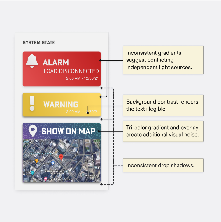
The design was colorful, gradients and drop shadows were applied with a heavy hand, and some hover animations felt jarring and unexpected.
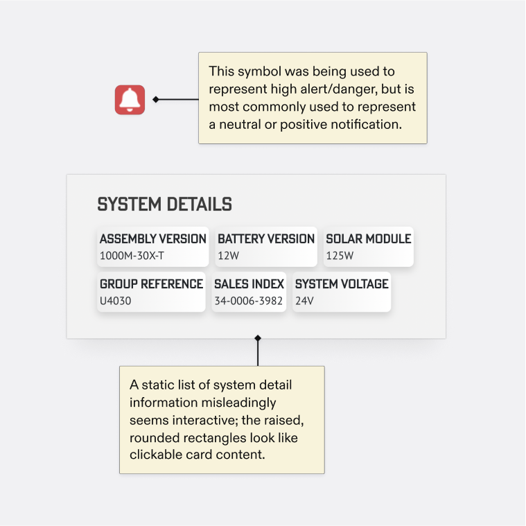
Common design patterns and symbols were being used in ways that strayed from their conventional uses, creating situations where the product didn’t behave the way the user expected.

The rectangular shape of all-caps text already poses a challenge to anyone with reading difficulties, and the typeface’s nonstandard letterforms were exacerbating the issue.
Further, text styles were unstandardized—auditing just a few pages produced 24 unique text styles.
The audit clarified the design priorities going forward.
Many messy sketches later, I settled on a basic structure which limited the dashboard contents to critical message banners, active alerts, and starred systems.
The existing design used cards for each system. I opted to use a data table instead, which allows the user to easily scan down or across a row of column to get a holistic view of a system’s health or compare metrics between systems.


Ultimately, I decided that switching to cards was the best way to provide a complete view of a system’s health without requiring awkward scrolling.
The logo also needed to be graphically simple—it should look good not only on the digital console but also on the physical products Bolton manufactures. I pulled a gear motif from the existing logo, rendering it with clean, sharp edges in a quarter profile with radial bars to evoke beams of sun and connectivity. I maintained the logo’s primary color of green, softening the hue and adding gradation between the bars. I chose Akzidenz-Grotesk for the wordmark, hand-kerning to adjust for even optical spacing. I provided the team with spacing guidelines based on fractional values of the x-height.

Referencing public systems—namely Atlassian, Elastic UI, and Carbon—I built a design system from the ground up with the goals of unifying visual language and enabling a more streamlined workflow for the developers.


I chose a utilitarian system font (SF Pro) with a minimal hierarchy of text styles, all aligned to a 4px baseline grid to ensure a consistent vertical rhythm.
To make the design system feel modern and prevent it from feeling overly harsh or cold, I softened corners and added thin, low-contrast borders. Elements had adequate breathing room internally and externally and adhered to an 8px grid system, adding the polish and harmoniousness the existing design was lacking.
Due to project constraints, I prioritized the desktop console. The user flow I decided to test was the primary use case for professional users:


Evaluating all three metrics required a combination of different testing methods.
How much information does the subject absorb after short exposure to one of the screens?
What is the subject’s gut reaction to the visual design? What judgments do they make about the product?
Does the navigational structure align with user expectations? Are features easily findable?
I carried out tests with four Bolton employees who were familiar with the concepts behind the console but had never seen it firsthand. Since I wanted to compare my design with the existing interface, I included comparable screens and switched the order of images for each subject.

Subjects were able to answer questions about the purpose, content, location, and structure of pages from the existing design with low to medium accuracy. In particular, they struggled to process information about the status of the power systems.
The same questions about the redesign were answered with much higher degrees of accuracy. Most subjects were able to correctly identify the specific alert type, and all were able to accurately describe the fundamental issue with the system’s power flow.
All subjects navigated through the flow as anticipated and confirmed that each step of the flow matched their expectations of what they would see before clicking.
They were able to complete short tasks with speed and ease (such as finding system maintenance notes, info about other systems in the group, etc).


In comparison, the existing console didn’t evoke the same degree of trust in the company or the underlying technology.
All participants expressed that they liked the power flow chart as a way to visually convey the inner workings of the system, especially the flow animation and the power trend statistic.

Here are two selected examples of problem areas and solutions:

Users gravitated to the alert banner, and some expressed wanting to click on it. By leaning into this urge and adding a button to view more information, the flow could be made even more intuitive.
When I asked one participant what his next steps would be after expanding the alert details, he replied:
If I was reaching out to a technician I work with closely, I’d probably screenshot [the alert details] and send it to them whatever way we normally communicate.
His answer raised an excellent point—instead of forcing users to contact their technicians by using the product’s internal contacting system, let them paste the alert details directly into their preferred messaging tool. This way, the product can integrate samlessly into the user’s existing workflow.

Bringing the design system and testing findings together, here is the redesigned Bolton monitoring console for desktop and mobile.
Note: If the videos aren't playing in your browser, you can also view them on Dropbox.